Related Posts

New school
A style that looks exactly like its decade
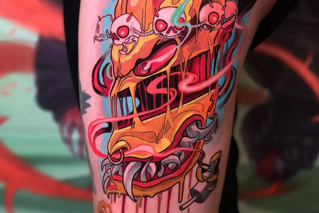
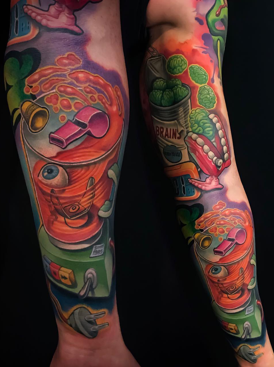
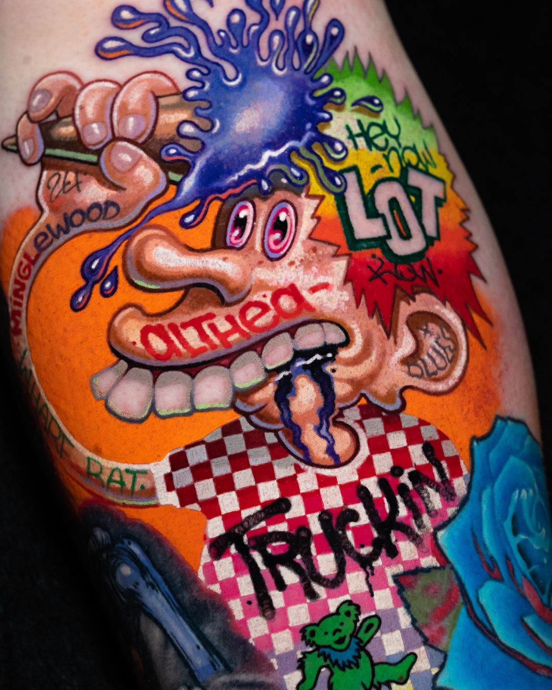
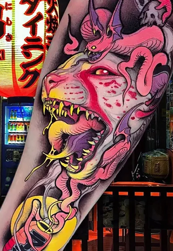
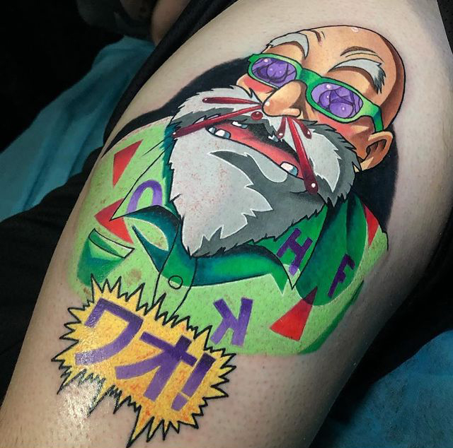
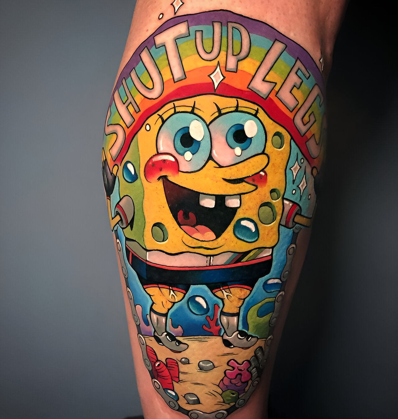
A cartoon devil with oversized eyes, a grin full of teeth, and ears stretched into exaggerated points, drawn in hot pink and lime green with a black outline that swells from hairline-thin to pencil-thick across a single curve. A hot rod with flames pouring off the back, chrome highlights rendered in white and pale blue, the whole thing drawn in cinematic perspective that would not fit in a flash sheet. A pin-up reimagined with the proportions of a Bratz doll — enormous head, tiny feet, a waist that would not exist on a person. These are the tattoos that defined new school in the 1990s, and they are instantly datable to that decade, the same way a flat-top haircut is datable to 1955.
New school is the most maligned of the major tattoo styles. Some of that reputation is earned; some of it comes from a reflex against cartoon imagery in a craft tradition that has come to prefer fine-art references. Either way, the style is also one of the most technically demanding in the tattooing repertoire, and the work of the best new-school artists has aged considerably better than the style’s general reputation suggests. A serious look at it is worth doing, because the new school did things no prior style had tried, and the techniques it developed have been absorbed into almost every coloured style practised today.
Where it comes from
New school emerged in the late 1980s and reached its full form in the 1990s, primarily in the United States. Its development coincided with three things: the explosion of American graffiti writing from the 1970s onward, the golden age of commercial animation at Disney and Warner Brothers, and the rise of underground comix — Robert Crumb, the Fabulous Furry Freak Brothers, Heavy Metal magazine, and the early work of artists like Coop and Robert Williams. The style is what happened when a generation of tattooers who had grown up with those visual worlds started tattooing.
The immediate predecessor was American traditional, and new school artists were mostly trained in traditional shops. The move away from traditional was gradual. Artists began pushing the outline weight harder, exaggerating proportions beyond what flash sheets allowed, and introducing colours — hot pink, electric purple, neon green, turquoise — that had only recently become available as tattoo pigments. What started as traditional with more attitude became, over a decade, a recognisable style in its own right.
The figures most commonly cited as central to its development include:
- Marcus Pacheco, who ran Primal Urge in San Francisco and is often credited with popularising the term “new school” in the early 1990s.
- Joe Capobianco, whose signature pin-ups with their stylised curves became one of the style’s most recognisable signatures.
- Jime Litwalk, who pushed the cartoon vocabulary into animation-influenced territory
- Jesse Smith, whose characters were borrowed directly from graffiti.
Mike Giant, whose work sits at the intersection of graffiti, illustration, and tattooing.
Several of these artists have since moved into adjacent styles, which is itself part of the story of new school — many of its central figures treat it as one vocabulary among several.

What makes a tattoo new school
The style has a set of consistent characteristics, though its outer edges shade into illustrative, neo-traditional, and cartoon-style tattooing.
The outline swells dramatically.
Proportions are exaggerated.
The palette is saturated and often includes non-naturalistic colours.
Highlights and gradients are done with spraypaint logic.
The composition is cinematic rather than iconic.
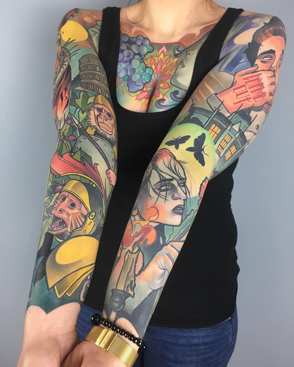
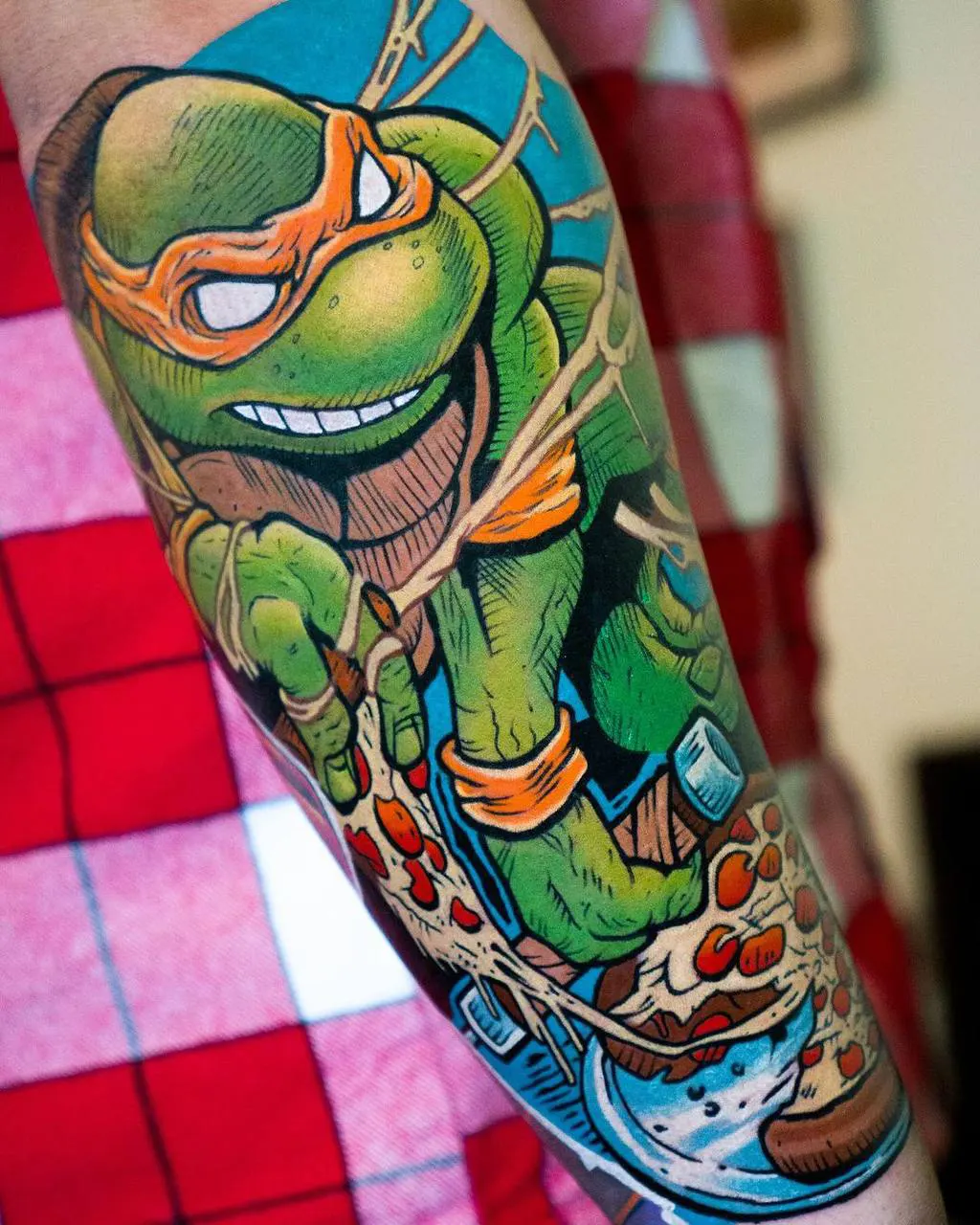
Subject matter is drawn from popular culture.
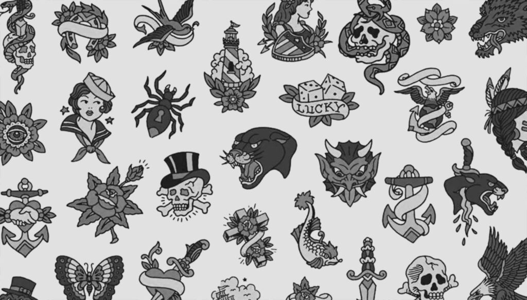
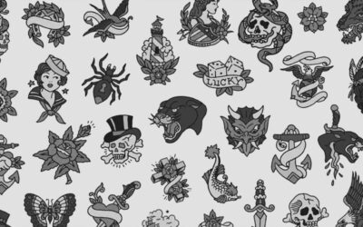
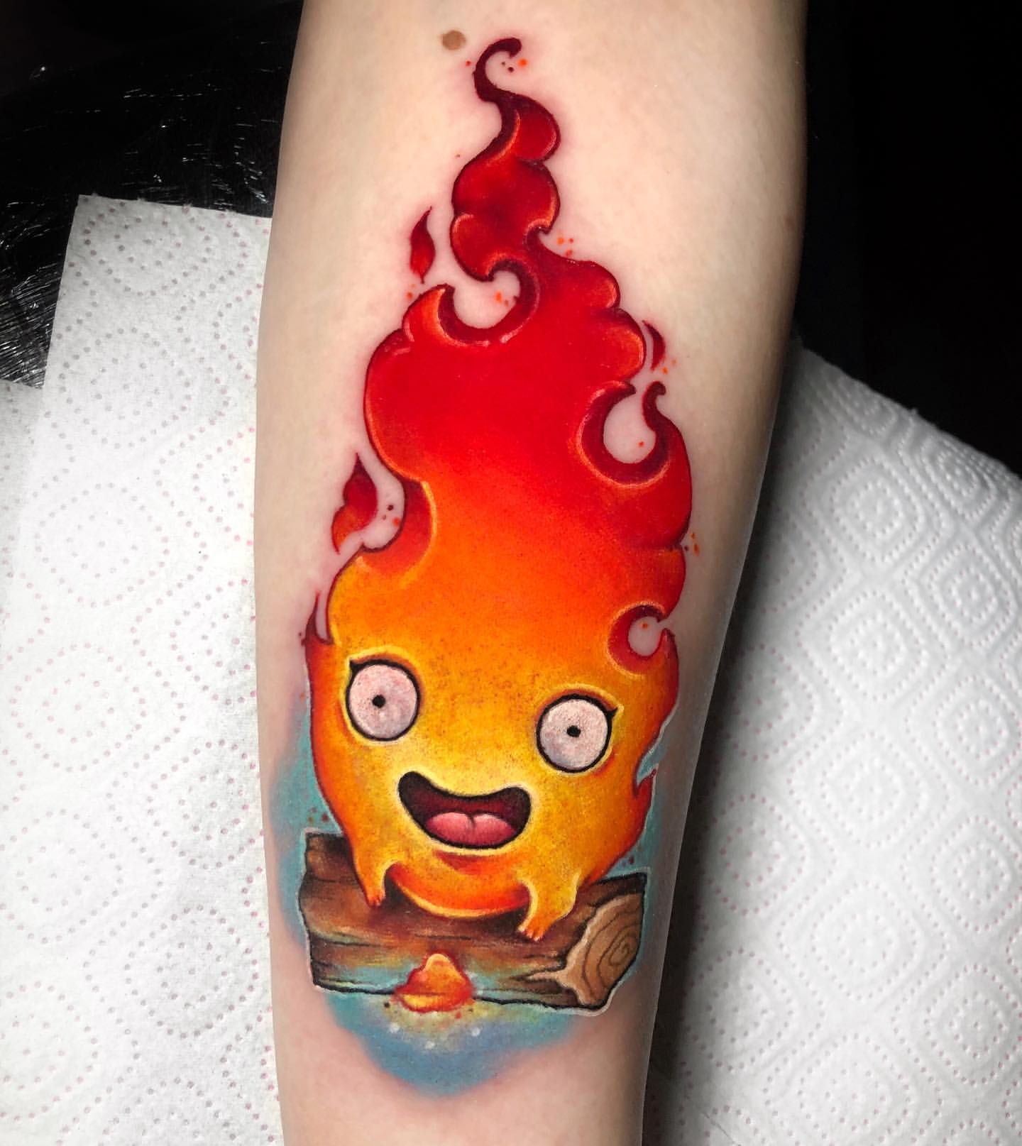
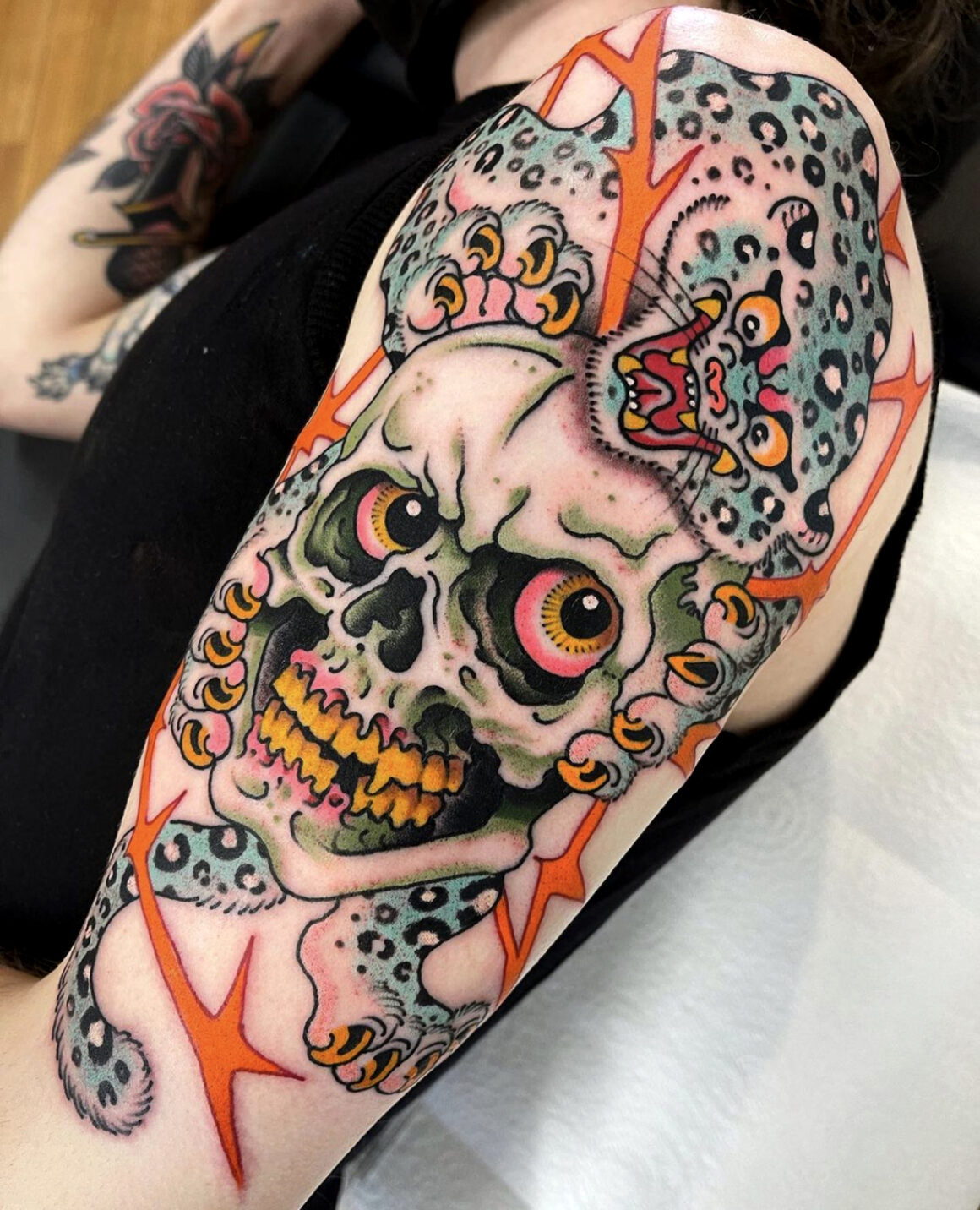
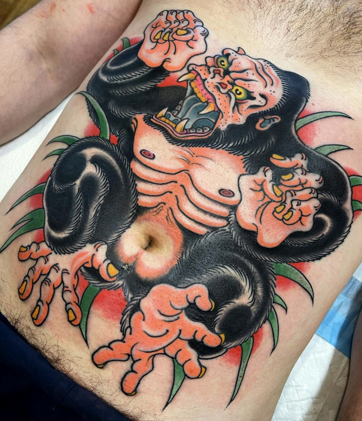
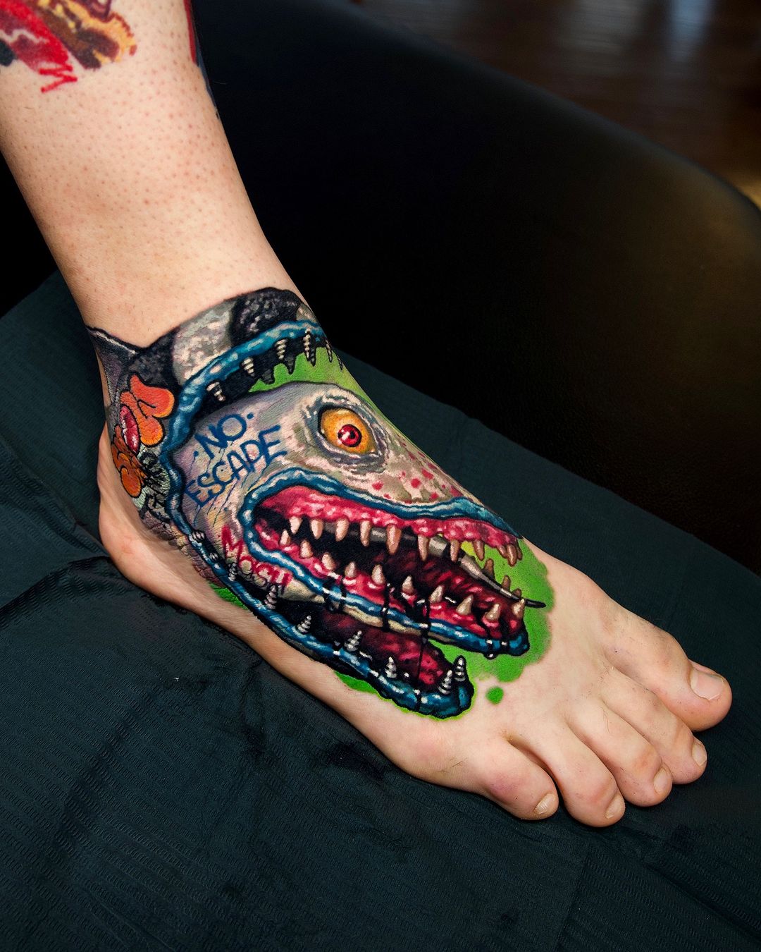
Monsters, hot rods, robots, pin-ups with cartoon proportions, anthropomorphic animals, skulls with cigars, dice, playing cards, pop-culture portraits, characters lifted from or inspired by cartoons and comics. The iconography has no pretensions to folklore or fine art. It draws on the same pool of imagery that produced airbrushed van murals and custom skateboards.
What separates it from adjacent styles
The boundaries matter, because new school is often blamed for work that belongs to other categories.
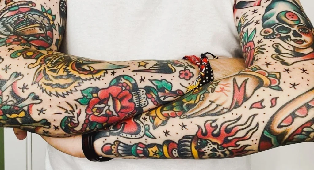
- American traditional is what the new school reacted against and grew out of. The differences are the variable line weight, exaggerated proportions, non-naturalistic palette, and cinematic composition. A traditional panther sits flat on the skin, and a new school panther lunges out of it.
- Cartoon-style tattooing overlaps with new school but is broader in scope. A cartoon tattoo might use consistent line weight and relatively restrained colour — closer to the pages of a children’s book than to the spray-painted aesthetic of classic new school. Most new schools are cartoon-style, but not all cartoon-style are new school.
- Illustrative work usually abandons the heavy outline that new school retains. Illustrative tattoos often want to look like drawings; new school tattoos want to look like tattoos that took their cues from comics and graffiti.
- Neo-traditional shares the new school’s expanded palette and sometimes its exaggerated proportions, but it draws its references from fine art and natural history rather than popular culture, and its line-weight variation is more controlled.
- Graffiti-style tattooing is a specific offshoot that retains the lettering conventions, spray-paint effects, and character work of graffiti while dropping some of the cartoon exaggeration. Mike Giant’s work sits firmly in this territory.
Why it looks the way it does
Several things converged in the 1980s and 90s to produce the specific visual language of new school.
Pigment technology had advanced enough to deliver the saturated, non-traditional colours the style requires. Hot pink, electric purple, neon green, bright turquoise — these were not reliably available in earlier decades. The same pigment revolution that enabled neo-traditional enabled new school, though the two styles used the expanded palette differently.
Tattoo machines became more precise. The cartridge needle systems that became standard in the 2000s, and the modular coil configurations that preceded them, allowed for cleaner outlines at varying weights and smoother colour packing across large areas. A dramatic line-weight shift within a single outline is difficult on older equipment but straightforward on newer equipment.
The reference library of American tattooing expanded. Tattooers working in the 1950s drew from flash sheets, carnival banners, military insignia, and nautical imagery. Tattooers working in the 1990s drew from comics, animation, skate graphics, album covers, magazine illustration, and graffiti. The change in reference material is as responsible for the stylistic change as any technical development.
Graffiti was the most direct influence. The conventions of piece-writing — drop shadows, highlights, three-dimensional lettering, character work in saturated colour with heavy outlines, characters that lean, jump, and break their own frames — were fully developed in American graffiti by the mid-1980s. Several of the most important new school tattooers came directly from graffiti backgrounds. The style is partly an attempt to do on skin what graffiti writers had already worked out on walls and trains.
Technical considerations
New school is technically demanding in ways that are easy to underestimate.
Variable line weight is the single most difficult element. A line that swells smoothly from hairline to several millimetres and back requires fine control over needle depth, machine speed, and the hand’s pressure. The variation has to look intentional and smooth. A wavering or uneven swell immediately reads as amateur work, and the failure mode is much more visible than in styles with consistent line weight.
Colour packing for saturated non-traditional tones is its own discipline. Hot pink is a notoriously difficult pigment to get into the skin cleanly and to keep saturated long-term. The same is true of electric purple and certain greens. Artists working in the style have to know which pigments from which manufacturers deliver the tones they want, and many new school artists are quite particular about their ink sourcing.
The gradient work at the scale and saturation required by the new school is more demanding than in most other styles. An airbrush-style highlight on a chrome surface has to read as a highlight at a glance, which means the gradient has to be convincing. Patchy gradients ruin the effect.
Composition in the cinematic mode is difficult because the tattoo has to work on a curved body surface. A composition that reads well on a flat page can collapse when wrapped around a bicep or a calf. New school artists who compose well do so by thinking about the three-dimensional surface from the start, not by drawing flat and adjusting later.
Ageing and longevity
The stereotype is that new school tattoos age badly. This is partly true and partly unfair. Pieces done with the cheaper pigments of the 1990s, particularly some of the early neon and fluorescent colours, have faded and shifted in ways that were not fully predicted at the time. Some of those colours were never meant to stay in the skin the way traditional pigments stay. Pieces from that era often look muddier now than they did when fresh, and the shifts have produced a particular aged-90s look that reads as immediately dated.
Pieces made after roughly 2010, with better pigments and artists who learned from earlier failures, are ageing considerably better. The heavy outline that new school inherited from traditional is doing the same work of holding the image together that it does in traditional tattooing. The saturated core palette — red, yellow, blue, strong green — holds up fine. The fluorescent outliers and the heavy reliance on white highlights remain weak points.
A new school piece, done well by a serious artist with considered pigment choices, will age competently. What it will not do is look timeless — the style carries the visual signature of the 1990s, the way American traditional carries the signature of the port-town shop era, and a client choosing the style is choosing that association, along with the imagery.
What works on skin and what does not
Scale is the first consideration. New school relies on internal detail — varied outline, layered colour, highlights, background effects — and that detail needs room. A new school character smaller than a palm loses most of what makes it interesting. Artists who specialise in the style usually have a minimum size below which they will not work, or will significantly simplify the design.
Placement favours large, stable planes. The upper arm, thigh, chest, back, calf, and ribs are the strongest locations. The style can be done on the forearm, but compositional choices get tighter. Hand, neck, and foot placements age poorly with new school more than with most other styles, because the combination of saturated colour, fine highlights, and friction accelerates the softening.
White highlights are the single biggest ageing risk. New school leans on white to create chrome, reflections, and pop, and white is the pigment that disappears fastest. Artists who know this either use white sparingly, place it carefully, or substitute pale skin-tint colours that hold better.
Fluorescent and neon colours should be treated with caution. Some of them hold, some of them do not, and the safety of some is still in doubt. A conversation with the artist about specific pigments and their track record is worth having before committing to a piece that depends on a bright fluorescent pigment for its effect.
Busy compositions need room to breathe. A new school piece that fills every millimetre of available skin with action tends to become unreadable at conversational distance, which defeats the purpose of the style. The best new school work often uses negative space as deliberately as traditional work does, even when the central subject is maximalist.
Choosing a new school artist
The style is widely advertised, and the quality range is extreme. A few things worth looking for.
Check whether the artist is genuinely working in new school or using new school elements within a generalist portfolio. Serious new school artists tend to have developed strong character design skills and a recognisable personal approach to the vocabulary. Artists who produce new school only on request, alongside every other style, rarely have the specific skills the style requires.
Check for line-weight variation in healed pieces. This is the single most reliable test of technical competence in the style. A swell that looks crisp at one year and at five years is evidence of a serious hand.
Check the colour choices across the portfolio. A good new school artist has a palette sensibility — certain combinations they return to, a consistent treatment of highlights and shadows. Randomness in the palette often indicates that the artist is defaulting to whatever the reference image showed rather than making colour decisions.
Look at pieces that are at least five years old if you can. Artists who have been in the style long enough to have work from the mid-2010s and earlier can show you how their specific technique has aged. This information is more valuable than any fresh photograph.
Where the style sits now
New school in its classic 1990s form is largely out of fashion. The current cultural moment favours either older styles (American traditional, Japanese traditional) or styles with fine-art references (neo-traditional, illustrative, realism). The specific bright-cartoon-on-skin look that defined new school is requested less often than it was fifteen years ago.
Several of the techniques new school developed have been absorbed into broader practice. Variable line weight is now a standard tool in most coloured styles. Cinematic composition has become common in illustrative and realism work. The saturated palette has fed into neo-traditional and cartoon-style tattooing. The style as a whole has contracted, but its technical contributions have spread.
There is also a small revival among younger tattooers, some of whom are treating the 1990s new school as a period style to be studied deliberately — the way an artist might now study 1950s traditional. These revivalist pieces tend to be more considered and more technically polished than the originals, but they trade some of the originals’ raw energy for that polish. Whether this becomes a sustained direction or remains a niche interest is too early to say.
For a client considering a new school piece now, the practical situation is good in some ways and limiting in others. The artists still working in the style are mostly those who have committed to it seriously, which means the average quality of the work available is high. The reference vocabulary is well established. The pigment technology is better than it has ever been. The main limitation is that fewer artists offer the style, and the ones who do often book far in advance. A person who wants a new school tattoo now will usually need to travel to get one from someone working at the top of the form.
Sources & further reading
- Margo DeMello, Bodies of Inscription: A Cultural History of the Modern Tattoo Community. Duke University Press, 2000.
- Anna Felicity Friedman, The World Atlas of Tattoo. Yale University Press, 2015.
- Matt Lodder, Painted People: Humanity in 21 Tattoos. Harper, 2024.
- Nick Schonberger and Rob Kingston, Forever: The New Tattoo. Gestalten, 2012.
- Henry Chalfant and Martha Cooper, Subway Art. Thames & Hudson, 1984; 25th-anniversary edition, 2009.
- Miss Rosen. In photos: the golden age of New York City’s graffiti scene. Huck Magazine, 2023.
- Mário Mateus. New School Tattoos: Creativity & Humour on Steroids. Tattoos Wizard, 2025.