Related Posts


American traditional
The style that refuses to age
Most tattooed people in the English-speaking world have seen a traditional piece in the last week, probably without registering it as a style choice. The vocabulary is embedded. Understanding where it came from, why it looks the way it does, and why it has outlasted every successor explains a surprising amount about tattooing as a craft.
Where it comes from
American traditional is a port-town style. It grew up in the tattoo shops that clustered near naval bases and harbours in the first half of the twentieth century — Honolulu, San Diego, Norfolk, the Bowery in New York, and Chatham Square. The clientele was sailors, soldiers, and the people who worked the docks. The constraints of the trade shaped the style completely.
A shop tattooer in 1935 was working with a coil machine, a small palette of pigments that were expensive and sometimes unreliable, and customers who wanted to be in and out in under an hour. The tattoo had to look good on the day, stay legible for decades on skin that would see sun, saltwater, and manual labour, and read from conversational distance — because a tattoo that cannot be recognised from a few feet away fails its basic social function. The visual rules that emerged came from those working conditions.
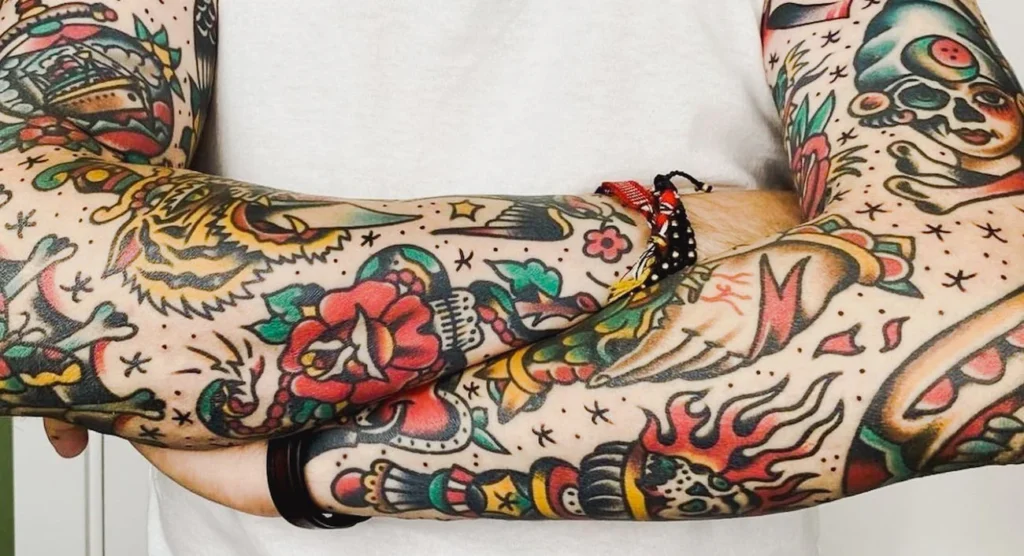
Bold black outline. A limited palette — traditionally red, yellow, green, and black, with blue and occasionally brown or purple added as inks improved. Solid colour packed flat, with no blending. Heavy black shading done in stipple or parallel line work instead of a smooth gradient. Simple iconic imagery drawn from a shared vocabulary. Deliberate use of negative space. Every element of the design is legible at arm’s length.
The conventions hardened into a tradition because they worked. A tattoo done this way in 1940 still reads cleanly in 1990. A tattoo done in a softer style from the same era often does not.
 † 1973 in Honolulu, Hawaii (USA) Untitled (Tattoo), 1967 Ink, watercolour on paper 25 x 35.5")
Sailor Jerry and the consolidation
The style has a patron saint: Norman Keith Collins — Sailor Jerry. Collins ran a shop on Hotel Street in Honolulu from the 1930s until his death in 1973, tattooing sailors on leave from Pearl Harbour and Pacific deployments. He was not the only tattooer of his generation, and he did not invent most of the imagery, but he refined it, codified it, and pushed the craft forward technically in ways that most of his contemporaries did not.
Collins corresponded with the Japanese master Horihide — Kazuo Oguri — and brought elements of Japanese composition into American traditional work: wind bars, water, and the use of large background elements to unify a sleeve. He experimented with pigment chemistry and was among the first Western tattooers to develop reliable purple inks. He insisted on sterilisation practices that were well ahead of the industry standard at the time. He drew constantly and left behind a flash archive — sheets of pre-drawn designs pinned to shop walls for customers to choose from — that still defines the style’s vocabulary.
Two of his closest associates, Ed Hardy and Mike Malone, carried the work forward after his death. Malone bought the Honolulu shop and kept it running for decades; Hardy went on to bridge American traditional and Japanese tattooing in a serious scholarly way, studying in Japan under Horiyoshi II and opening shops in California that trained the next generation. The lineage matters because American traditional is a style passed down. Its rules are learned by copying flash sheets, studying old photographs, and apprenticing under someone who learned the same way.
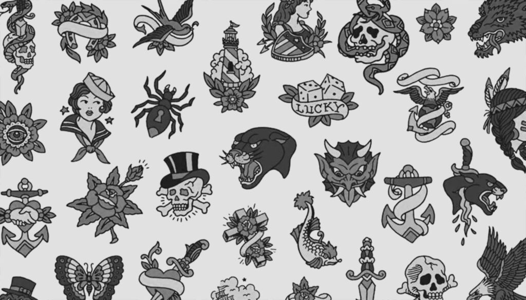
Style's vocabulary: most popular tattoos and their traditional meaning
The images that define the style are not arbitrary. Each one came into the repertoire because it meant something to the sailors and working men who were the original clientele, and the meanings have persisted even as the customer base has broadened.

Swallow

Anchor
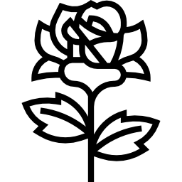
Rose

Dagger through a heart

Pin-up

Panther

Other staples
- Nautical star — a five-pointed star in two colours used as a guide-home symbol.
- Horseshoe — usually with the opening upward so the luck does not run out.
- Four-leaf clover — the snake, often wrapped around a dagger or a rose; the skull, sometimes with a rose in its teeth or a top hat.
- Ship in full sail — which was a major undertaking and a mark of an experienced tattoo client.
Why it looks the way it does
The technical choices are all about longevity on the skin. A tattoo is not ink on paper; it is pigment suspended in the dermis, between one and two millimetres down, and that pigment is subject to slow dispersal over decades. Fine detail blurs. Thin lines thicken. Subtle colour gradients flatten out. Light colours fade faster than dark ones, and red fades faster than most. Anything delicate looks worse in twenty years than it did on the day of application.
American traditional was designed through a century of trial and error to age well. The thick outlines absorb some blur without losing definition. The flat colour fields stay legible even as individual pigment particles drift. The high contrast between filled black and bare skin means the design continues to read as a shape long after the finer details have softened. A traditional tattoo done by a competent artist in 1960 and photographed in 2020 will still look as it was meant to.
The iconography works the same way. A rose with five petals is still a rose if the edges get fuzzy. A face with subtle expression — a realistic portrait, for example — becomes a different face as the ink moves. The traditional vocabulary uses shapes robust enough to survive their own fading.
 † 1973 in Honolulu, Hawaii (USA) 2.H (Tattoo), 1973 mixed media on paper 25.5 x 35.5 cm")
Placement and composition
Traditional tattoos are composed for the body, not for the photograph. The shapes are designed to sit comfortably on the specific planes of skin they occupy: an anchor on the forearm follows the line of the ulna; a swallow on the chest sits in the hollow below the collarbone; a ship’s wheel on the back of the hand uses the circular shape of the available real estate. When a full sleeve is built in a traditional style, it is usually composed of a loose collection of separate images unified by a background — wind bars, water, banners, small filler elements like stars and dots — rather than as a single large illustration.
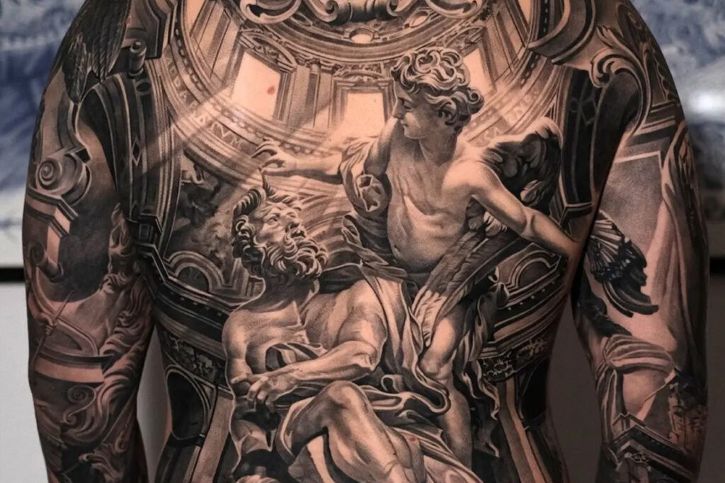
This is the opposite of the photorealistic or illustrative sleeve, which treats the arm as a continuous canvas for one image. Traditional work keeps each element discrete and readable. A client can add to the sleeve over the years without the composition breaking, because the style was built for accumulation.
What separates good traditional work from bad
The common misconception is that American traditional music is simple. It is simple to describe and difficult to execute well.
The outline is the hardest element. A traditional line is a single confident stroke, usually done in one pass, with consistent weight along its length. A wavering or inconsistent outline immediately reads as amateur work. Artists spend years learning to lay a clean line at the required weight without hesitation, because any hesitation shows.
Colour packing is the second discipline. The red, yellow, and green of a traditional piece have to go in fully saturated and evenly distributed, with no patchiness. This is surprisingly difficult on some skin types and requires careful needle technique. A patchy fill that heals with bald spots will look unprofessional forever.
Composition is the third. A good traditional artist knows how to size and place an image so it sits correctly on the body part, balances with what is already there, and leaves room for future work. A bad one takes a flash design at its printed size and applies it without adjustment.
The reason traditional work rewards apprenticeship is that these skills do not transfer cleanly from drawing on paper. They are built by doing the work on the skin under supervision for years.
The revival and the present
American traditional went through a quiet period in the 1970s and 80s, overshadowed by the rise of fine-line black-and-grey work from Chicano prison traditions, the spread of Japanese influence through Ed Hardy and others, and later the explosion of photorealism and coloured illustrative work in the 1990s and 2000s. The style never disappeared — there were shops keeping it alive continuously — but it was not the default.
The revival came from a generation of tattooers in the late 1990s and early 2000s who returned to the original flash sheets, studied them closely, and committed to working within the tradition rather than around it. Shops like Smith Street Tattoo in Brooklyn and Frith Street Tattoo in London became reference points for a younger generation learning the style from within. The Sailor Jerry brand licensing, whatever else one thinks of it, put the original flash in front of people who had never seen it.
Today, American traditional is one of the most requested styles in Western tattoo shops. Its appeal is partly aesthetic, partly nostalgic, and partly practical — a tradition with a century of evidence that the work holds up. A person getting a traditional piece today is participating in a visual language that their great-grandfather might have recognised on a dock worker’s arm.
 † 1973 in Honolulu, Hawaii (USA) 1.Y (Tattoo), 1973 mixed media on paper 25 x 35.5 cm")
Choosing a traditional piece
A few practical observations for anyone considering the style.
Pick an artist who specialises in it. American traditional rewards specialists, and a generalist shop that offers the style as one option among many, will usually produce weaker work than a shop built around it. Look at healed photographs of the artist’s work — not fresh — because the healed image is the real test. A piece that looks stunning on the day and patchy after three months has failed.
Expect the work to be readable. Traditional tattoos are designed to communicate quickly. If the design requires an explanation to make sense, it is not traditional; it is using traditional elements within a different idiom.
Consider the full inventory before requesting something custom. The traditional repertoire contains most of what people reach for, and a well-executed classic design from the flash will almost always look better than a bespoke variation that pulls the style out of its own logic. The designs have been tested by a hundred years of bodies.
Place it where it belongs. Traditional work looks best on the forearm, upper arm, chest, back, calf, and thigh — the large, flat, slow-moving planes the style evolved for. It can be done elsewhere, but the further from the traditional placements, the more the compromises start to show.
What the traditional style is for
American traditional is a craft tradition in the oldest sense: a body of knowledge passed from one person to the next, refined by working conditions, preserved by repetition, and judged by whether the work still looks right in forty years. The designs that were good in 1935 are the same designs that are good now, for the same reasons.
Most tattoo styles age out. Photorealism from the mid-2000s already looks dated; watercolour work from the 2010s is starting to show its decade. American traditional looks the same as it did when Norman Collins pinned the first flash sheet to his wall on Hotel Street. A style that has already survived a century has earned the benefit of the doubt about the next one.
Sources & further reading
- Ed Hardy, Wear Your Dreams: My Life in Tattoos. Thomas Dunne Books, 2013.
- Ed Hardy and Joel Selvin, Tattooing the Invisible Man: Bodies of Work. Hardy Marks Publications, 2000.
- Michael Malone (ed.), Sailor Jerry Collins: American Tattoo Master. Hardy Marks Publications, 1994.
- Don Ed Hardy (ed.), Tattootime, five volumes, Hardy Marks Publications, 1982–1991.
- Margo DeMello, Bodies of Inscription: A Cultural History of the Modern Tattoo Community. Duke University Press, 2000.
- Albert Parry, Tattoo: Secrets of a Strange Art. Simon & Schuster, 1933; reissued in 2006, Dover.
- Steve Gilbert, Tattoo History: A Source Book. Juno Books, 2000.
- Carmen Nyssen, Buzzworthy Tattoo History, multiple volumes (buzzworthytattoo.com).
- The Tattoo Archive. Winston-Salem, NC.
- Tattoo Nation movie, dir. Eric Schwartz, 2013.
- Tattoo: A Scarred History. Discovery Channel, 2004.